The Secret Language of Color: Mastering Wardrobe Harmony
Did you know that the average person spends over six months of their life deciding what to wear? While that might seem like a lot, a significant portion of that indecision stems from one fundamental question: what colors go together? For many, color pairing feels like an innate talent possessed by a select few, a magical ability to effortlessly create stunning ensembles. But here’s the truth: understanding color is a skill, and like any skill, it can be learned and honed. It’s not about luck; it’s about knowing the principles that govern how colors interact and using them to your advantage. Let’s dive into the best styling tips for pairing colors in your wardrobe and transform your daily dressing routine from a chore into an art form.
Beyond Basic Black and White: Embracing the Power of Palette
While neutrals are undeniably the foundation of any well-curated wardrobe, relying on them exclusively can lead to a predictable, albeit safe, aesthetic. The real magic happens when you start to explore the vibrant world of color. Mastering how to combine hues isn’t just about avoiding clashes; it’s about creating visual interest, conveying mood, and amplifying your personal style. Think of color as a powerful tool in your sartorial arsenal, capable of making you feel confident, sophisticated, or playful. The best styling tips for pairing colors in your wardrobe will empower you to wield this tool with precision.
#### Understanding the Color Wheel: Your Foundational Guide
Before we get too far, let’s briefly touch upon the color wheel. It’s not just for art class; it’s a fundamental tool for understanding color relationships.
Complementary Colors: These are colors directly opposite each other on the wheel (e.g., blue and orange, red and green). They create high contrast and a vibrant, energetic look when paired. Use them strategically for a bold statement.
Analogous Colors: These are colors that sit next to each other on the wheel (e.g., blue, blue-green, green). They offer a more harmonious and serene feel, creating a sense of unity in an outfit.
Triadic Colors: These are three colors evenly spaced on the wheel (e.g., red, yellow, blue). They create a balanced and vibrant palette, but often require careful balancing to avoid being overwhelming.
#### Leveraging Neutrals: The Art of Subtlety
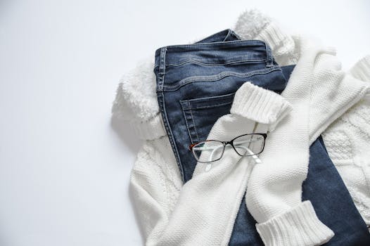
Neutrals – black, white, gray, beige, navy, and brown – are your wardrobe’s reliable anchors. They possess the incredible ability to ground bolder colors or to create an understated, sophisticated look on their own. The key to elevating your neutral game lies in texture and shade.
Mixing Neutrals: Don’t be afraid to pair different neutrals. A charcoal gray blazer with cream trousers, or a navy dress with camel boots, creates a far more interesting and luxurious effect than monochromatic dressing.
Playing with Texture: A chunky knit beige sweater paired with silk cream pants offers a delightful tactile and visual contrast that’s far more engaging than two flat, similar fabrics.
Shades of One Neutral: Consider an outfit built entirely around shades of grey – from a light dove to a deep charcoal. This creates depth and sophistication without introducing other colors.
Building Confidence: Color Pairing Strategies for Every Occasion
Now, let’s get practical. How do you actually implement these ideas? The best styling tips for pairing colors in your wardrobe focus on building confidence and understanding what works for you.
#### The “Third Piece” Rule: Elevating Simple Silhouettes
One of my favorite, and simplest, styling tricks is the “third piece” rule when it comes to color. If you’re wearing a monochromatic base (like a simple black top and black pants, or a white tee and white jeans), adding a colorful jacket, cardigan, scarf, or even a vibrant bag as your “third piece” instantly elevates the outfit. This allows you to dip your toes into color pairing without feeling overwhelmed. A classic example is a crisp white shirt and blue jeans, elevated by a bold red blazer.
#### Monochromatic Magic: Sophistication in Sameness
Contrary to what some might believe, wearing a single color from head to toe can be incredibly chic and elongating. This is where playing with different shades and textures of that one color becomes crucial. Think of a deep emerald green blouse with forest green tailored trousers, or a soft lavender dress with lighter lilac heels. It creates a polished, intentional look that’s surprisingly impactful. It’s a fantastic way to embrace a bold hue without the complexity of pairing it with another color.
#### The Power of an Accent: Small Doses, Big Impact
Not everyone is ready to don a head-to-toe vibrant ensemble, and that’s perfectly okay. The beauty of color pairing often lies in the subtle details.
Accessories as Stars: A vibrant handbag, a colorful scarf, or a pair of striking shoes can inject personality and style into an otherwise neutral outfit. This is an excellent way to experiment with trending colors without a major commitment.
A Pop of Color: Consider a bright top peeking out from under a neutral jacket, or colorful socks with loafers. These small touches demonstrate a keen eye for style and can be incredibly effective.
Beyond the Wheel: Practical Tips for Real-Life Styling
While color theory provides a framework, real-world styling involves intuition and personal preference. Here are some further tips to refine your color-pairing skills:
#### Consider Your Undertones: Finding Your Most Flattering Hues
This is a game-changer, and often overlooked. Understanding your skin’s undertones (warm, cool, or neutral) can significantly impact which colors make you look radiant and which might make you appear washed out.
Warm Undertones: Tend to look best in earthy tones like olive green, mustard yellow, deep reds, and warm browns. Gold jewelry often complements these tones.
Cool Undertones: Often shine in cooler colors like blues, purples, emerald greens, and crisp whites. Silver jewelry tends to be more flattering.
Neutral Undertones: Lucky you! You can generally wear a wider range of colors.
A simple way to test this is to look at the veins on your wrist in natural light. If they appear more green, you likely have warm undertones. If they look blue or purple, you have cool undertones. If it’s a mix, you might be neutral.
#### Don’t Forget Color Personalities: Mood and Message
Colors evoke emotions and can subtly communicate messages. When pairing colors, think about the mood you want to convey.
Blues: Often convey calmness, trust, and professionalism.
Reds: Signify passion, energy, and boldness.
Yellows: Represent happiness, optimism, and warmth.
* Greens: Suggest nature, growth, and balance.
Pairing a vibrant coral with a soft navy can create a look that’s both energetic and grounded, perfect for a creative professional setting.
#### Embrace Imperfection: The Beauty of “Almost”
Sometimes, the most interesting color combinations aren’t perfectly matched. A slightly muted shade of a color paired with a brighter, related hue can create a sophisticated, lived-in look. Think of a dusty rose blouse with a deep burgundy skirt. It’s not a stark contrast, but the subtle interplay of the colors adds depth. This is where understanding color families (warm, cool, jewel tones, pastels) becomes more valuable than strict adherence to the color wheel.
Final Thoughts: Your Wardrobe is a Canvas
Learning the best styling tips for pairing colors in your wardrobe is an ongoing journey, not a destination. It’s about experimentation, paying attention to what makes you feel good, and gradually building confidence in your choices. Don’t be afraid to step outside your comfort zone. Start small with accessories or a single colorful piece. Remember, your wardrobe is your personal canvas, and color is your most expressive medium.
So, how will you start painting your own unique palette tomorrow?